
Evolve was due for a real brand. The old logo was a pain to work with, tight kerning,
legibility issues, and a nightmare in print. Nobody liked it, and everybody knew it. I led the full
redesign from the ground up, starting with a new logo built to actually work, then rolling out a
brighter, more vibrant take on the color palette with everything else built around it.
The real work was in what came after. People illustrations, house scenes, location graphics, patterns,
icons, all of it designed to give the brand genuine range. Fun enough for guests, professional enough
for owners, and flexible enough for a team that was growing fast.
Branding Color Design System Creative Direction Illustration Icon System Print Swag Design
Clean, modern, and built to last. The kind of mark people actually recognize. The butterfly was basically clip art with a trademark symbol slapped on it — we don't talk about that anymore.
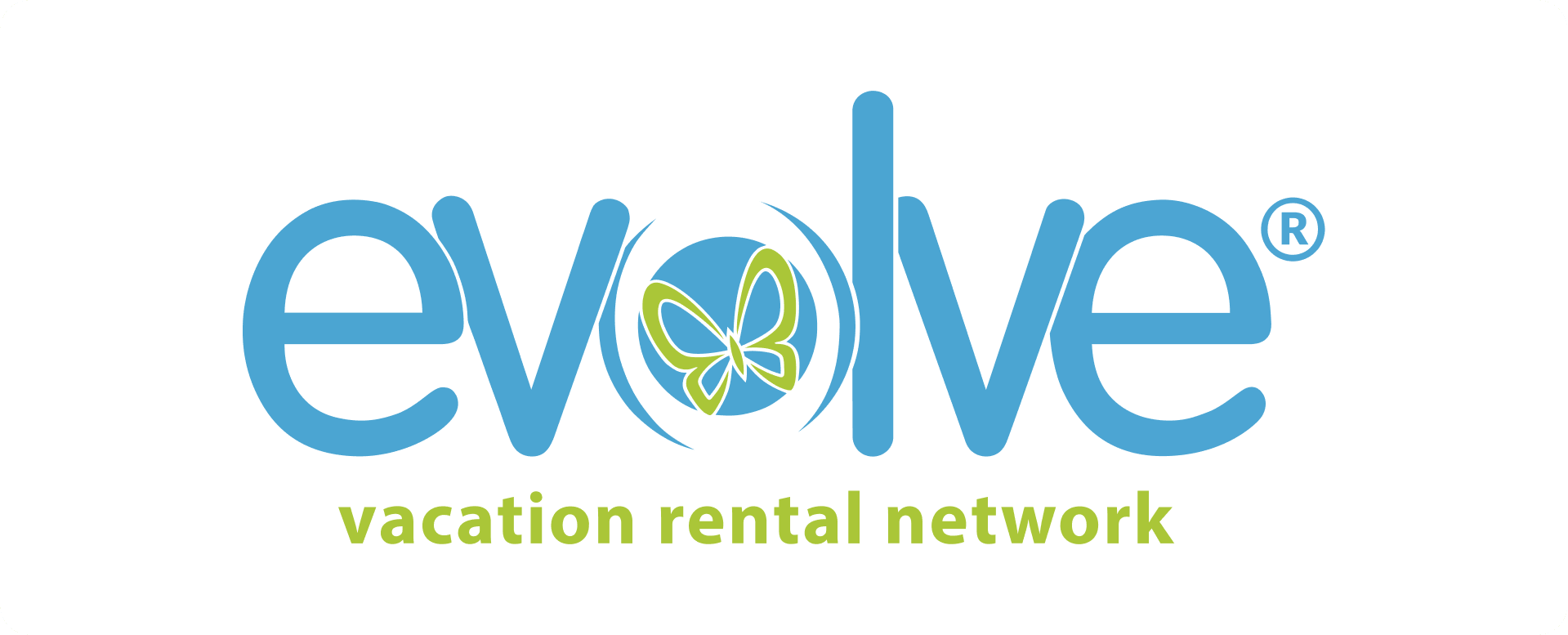 Before
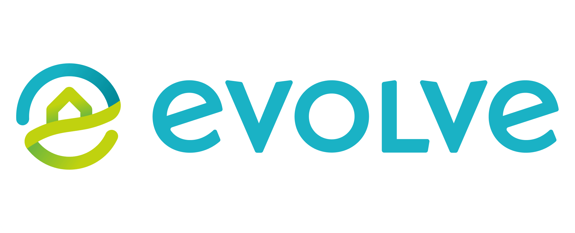 After
After
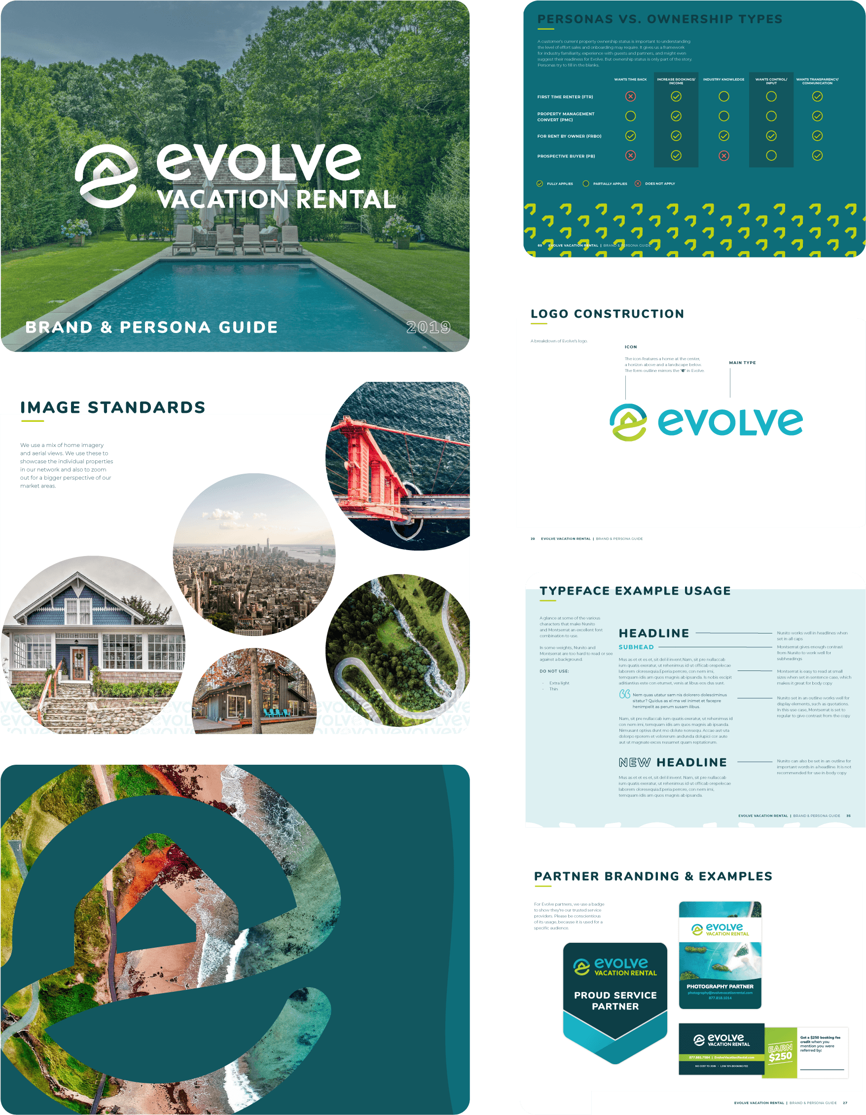
Before this, nothing existed. No rules, no reference, no foundation for anyone to build from. This was the first time Evolve had everything in one place, from brand purpose and archetype to the full visual system and a deep set of guest and owner personas. It gave the team something to actually work from.
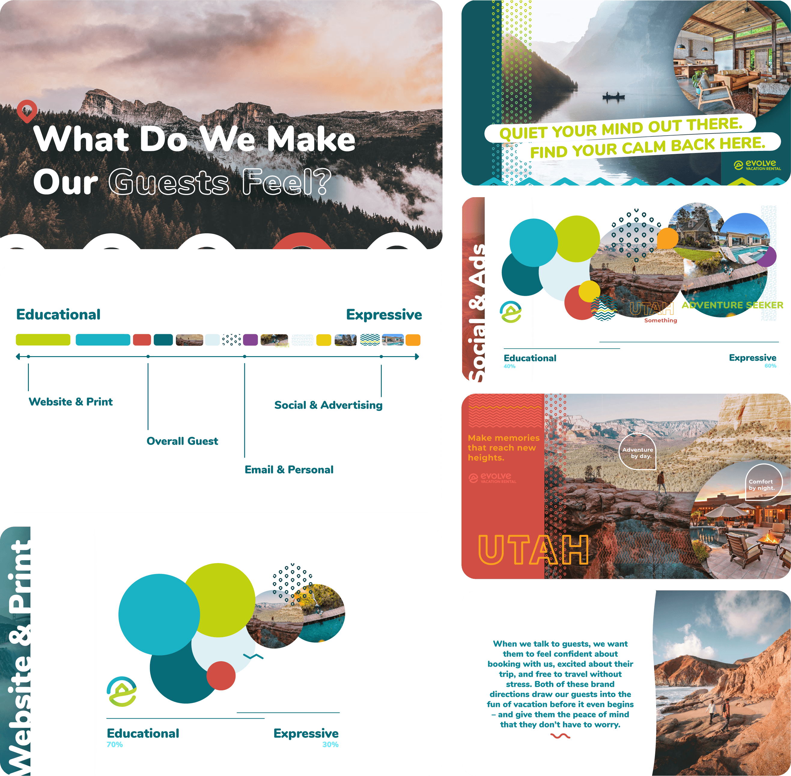
Thea and I built this together while we were both at Evolve. She wrote, I designed. The deck explored two brand directions for how Evolve should talk to guests, both built around the same idea: the moment you book a trip, you should already be living it. Listening to brass bands in New Orleans, sipping cocoa before the slopes in Aspen. Just show up and let the fun begin.
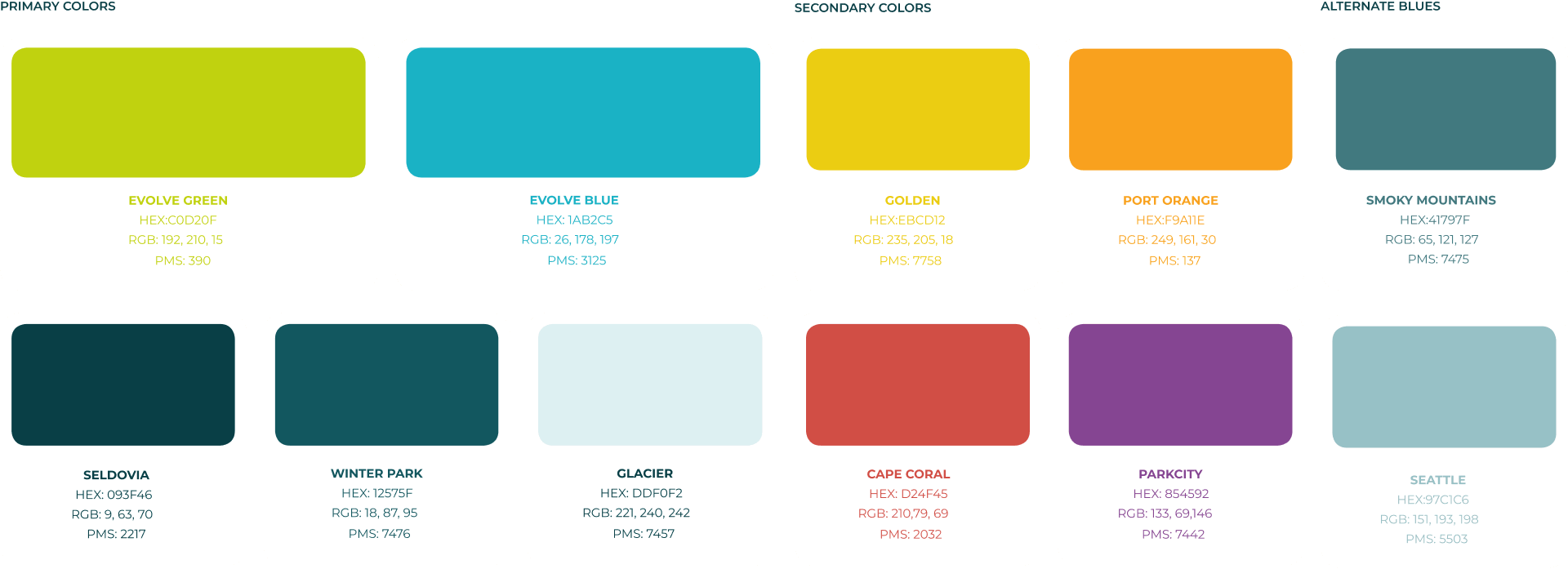
Travel demands range. A single destination palette wasn't going to cut it, so the color system expanded to support the full breadth of where Evolve's properties could take you. Warm, cool, vibrant, and grounded, with enough flexibility to feel at home in a beach house or a mountain cabin.
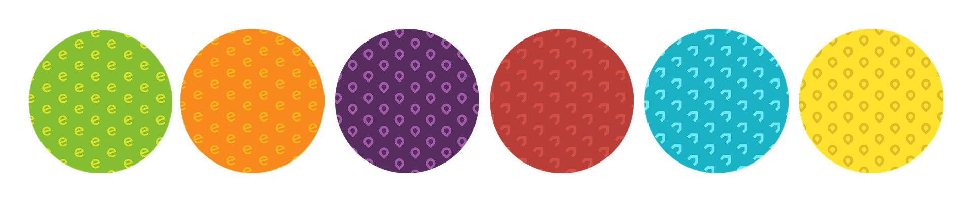
A comprehensive icon library built on a consistent framework for use across product and marketing. Alongside that, a set of patterns pulled from the logo to add visual interest wherever a design needed it.
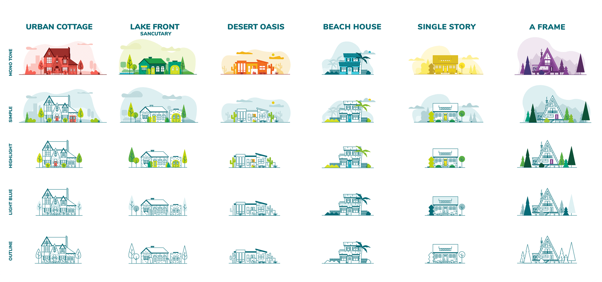
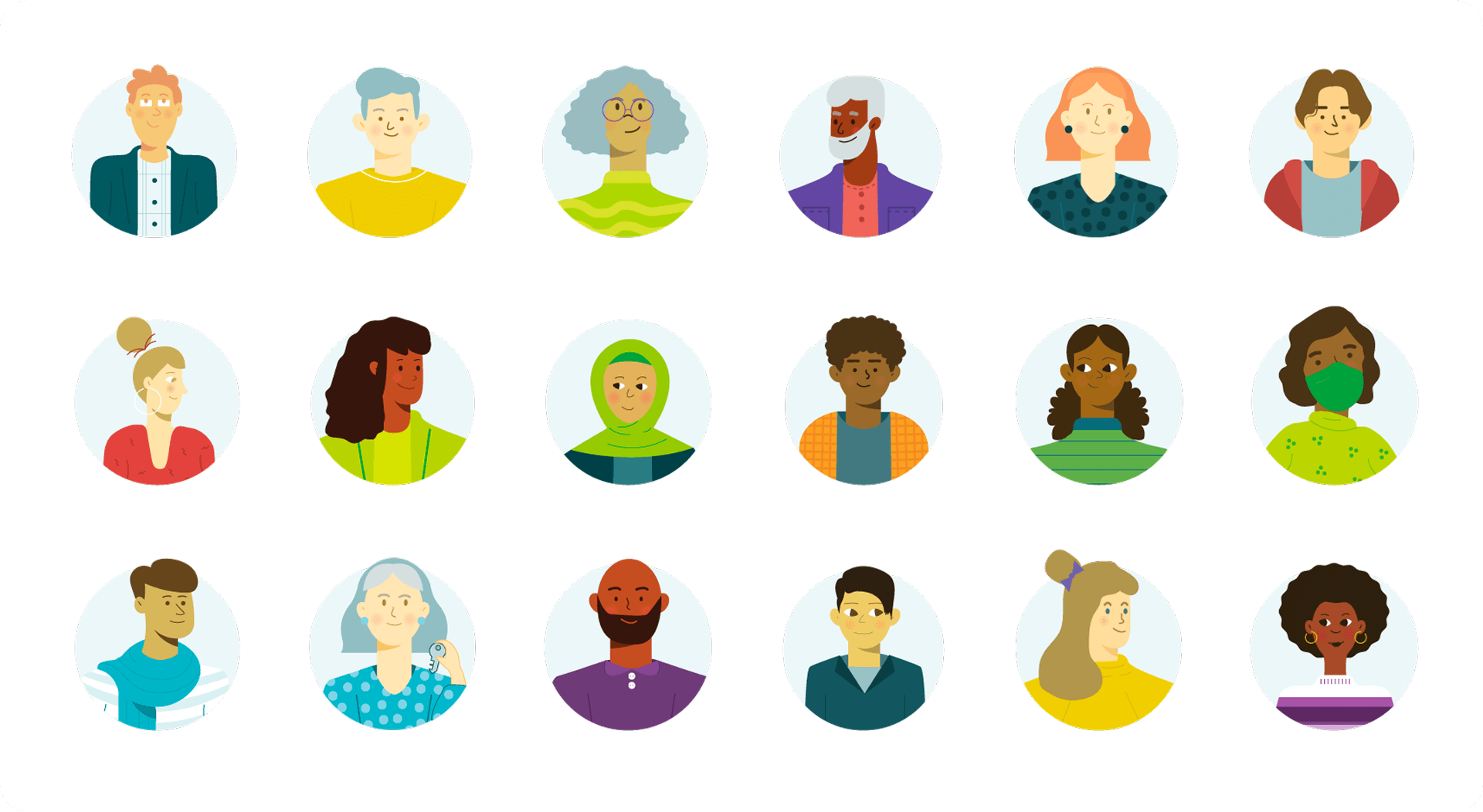
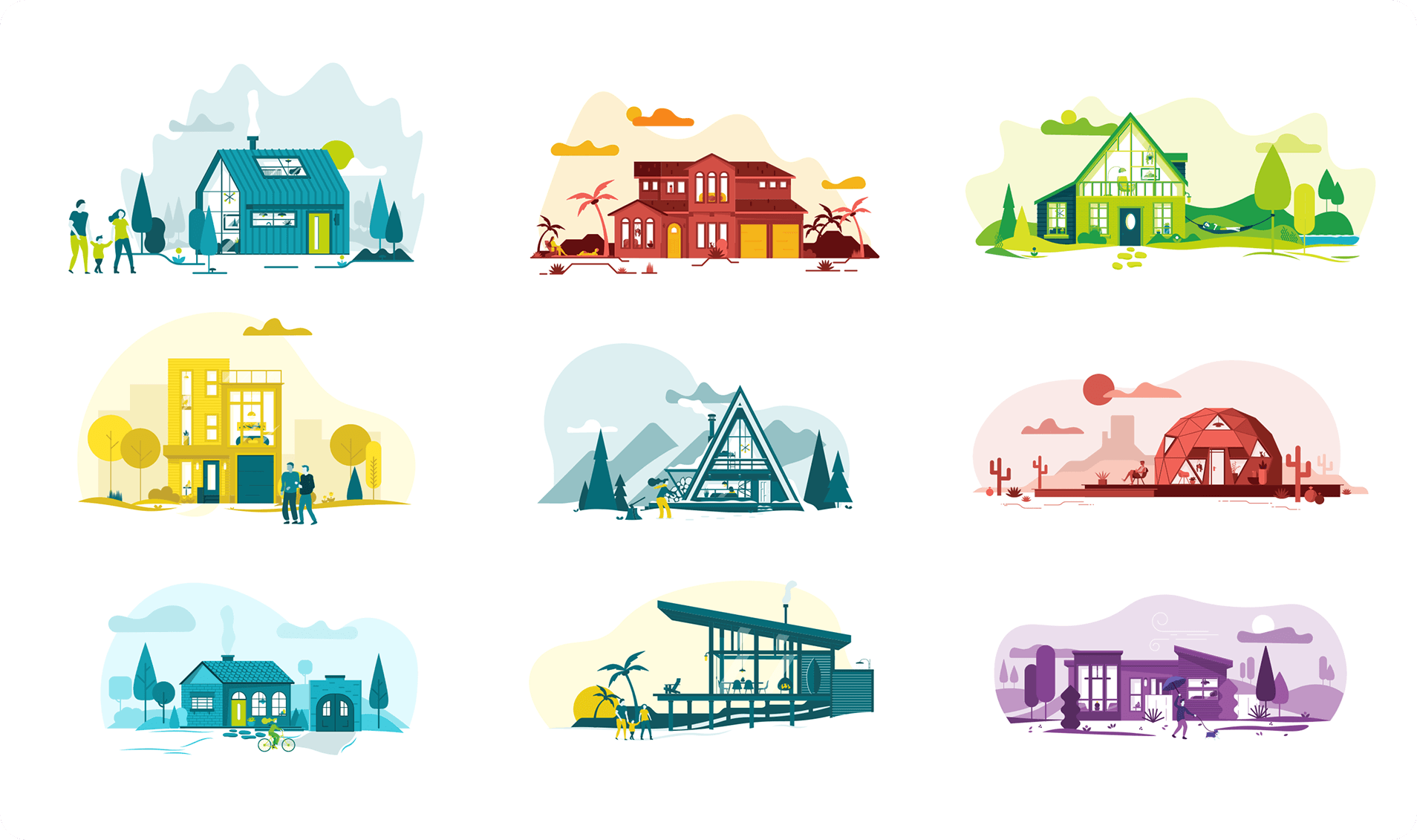
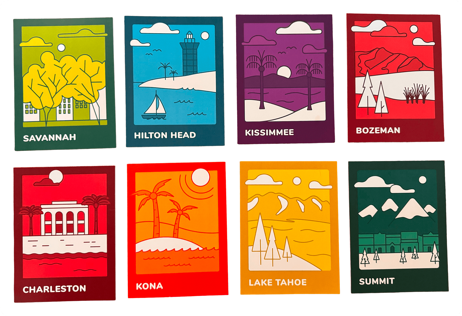
Three sets built to give the brand a full visual world. The house library alone covers dozens of property types across multiple color treatments, from urban cottages and A-frames to yurts, tiny homes, and desert ranches. The people set was hand-drawn to feel genuinely diverse, every person their own. The home scenes brought it all together, placing people inside full destination environments from mountains to beaches to desert.
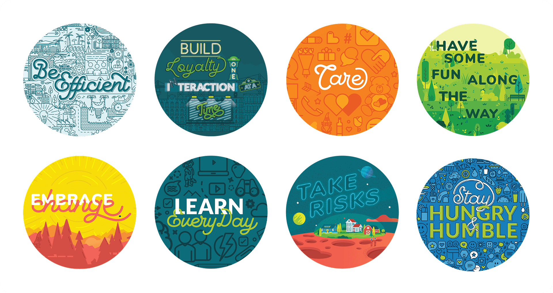
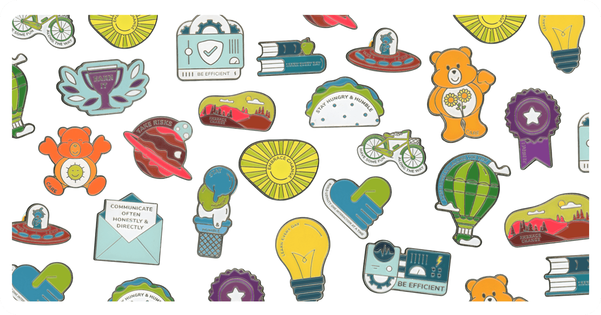
Ten values, ten large-scale murals. Each one pitched to leadership with a
simple idea: make the office walls say something. Every value got its own world, its own personality, and a few
hidden details worth finding.
Explore them at Fullsize ➜
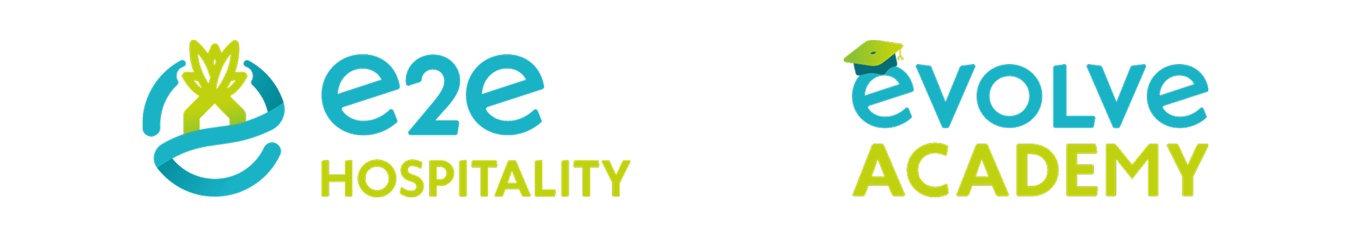
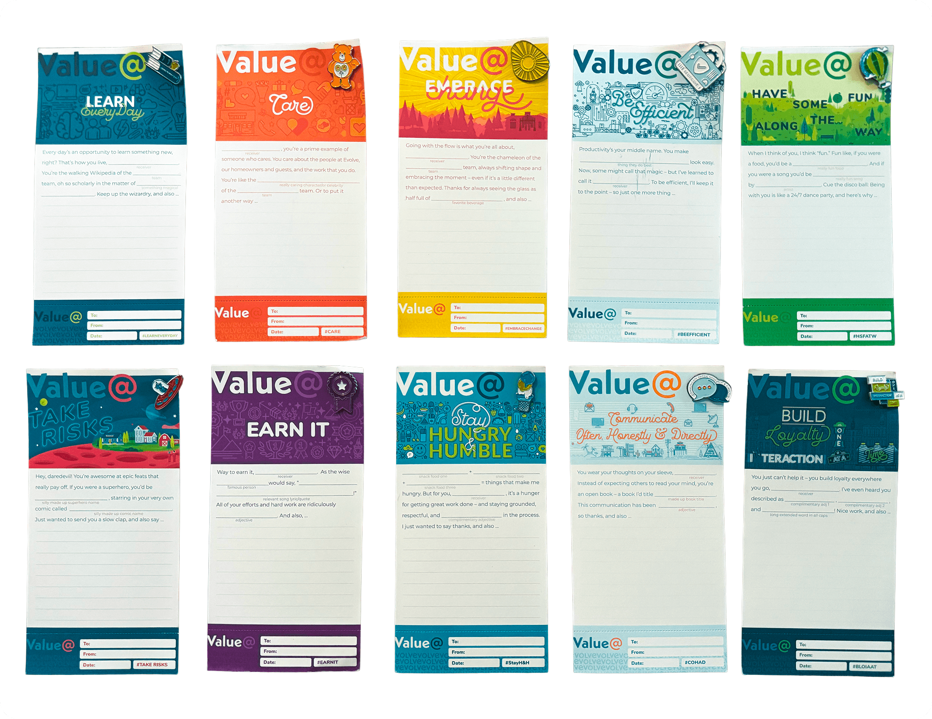
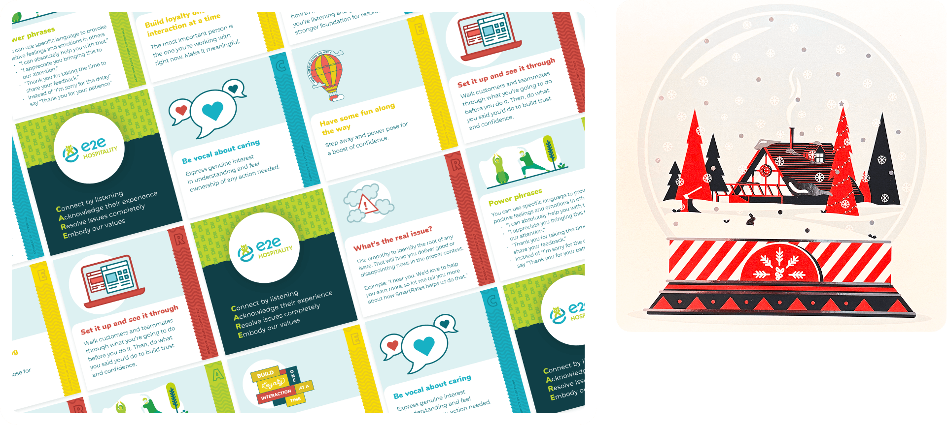
Internal logos for e2e Hospitality and Evolve Academy, value cards with a mad-lib twist that made recognition feel personal, and e2e training cards to help customer-facing teams live the brand language every day.
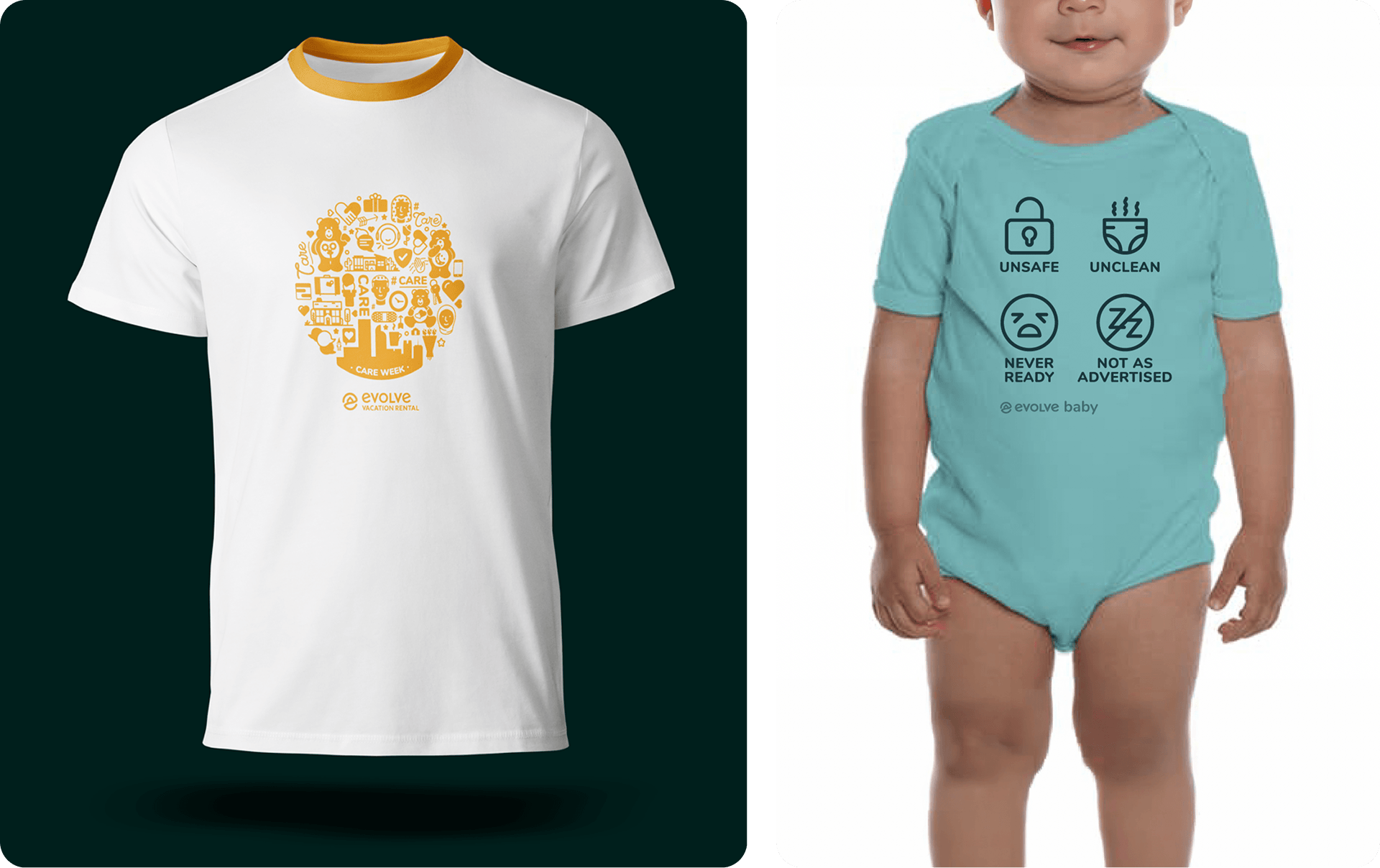
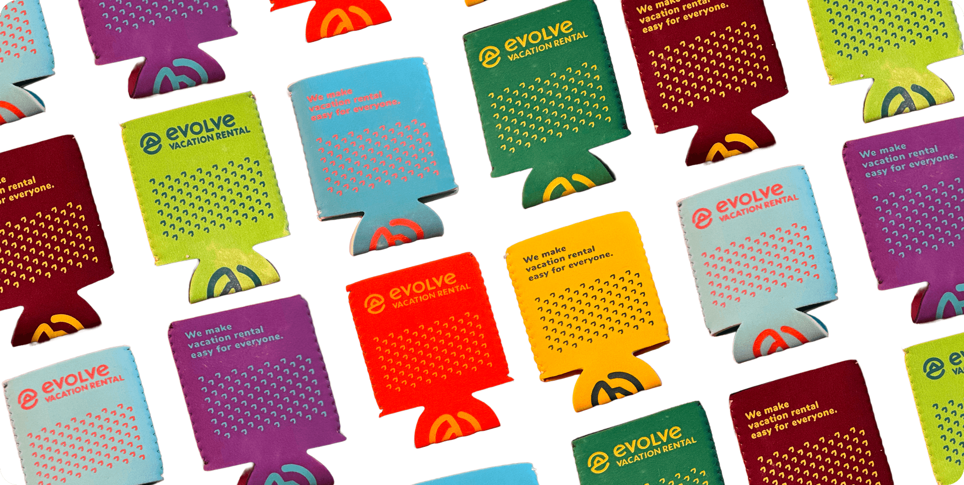
A Care Week t-shirt built from the Care wall graphic and its elements, scaled into a tight circular print. Koozies in every brand color, and an "Evolve Baby" onesie calling out the four things a vacation rental should never be. That last one got some laughs.
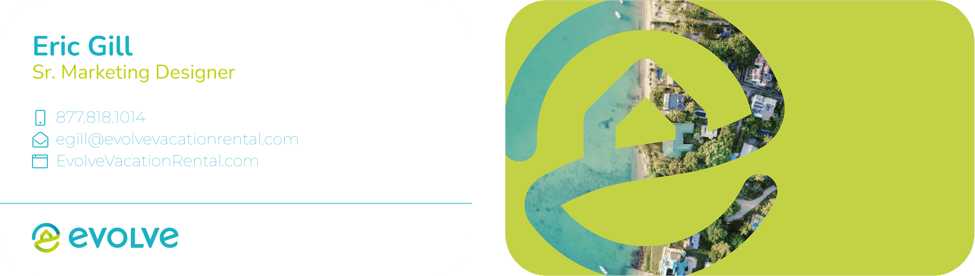
Business cards with an aerial property photo die-cut through the logo on the back. Location cards for each conference room illustrated in a bold, travel-poster style. And enamel pins for every value, each one designed as its own character.
 in Colorado.
 Eric Gill ©
