
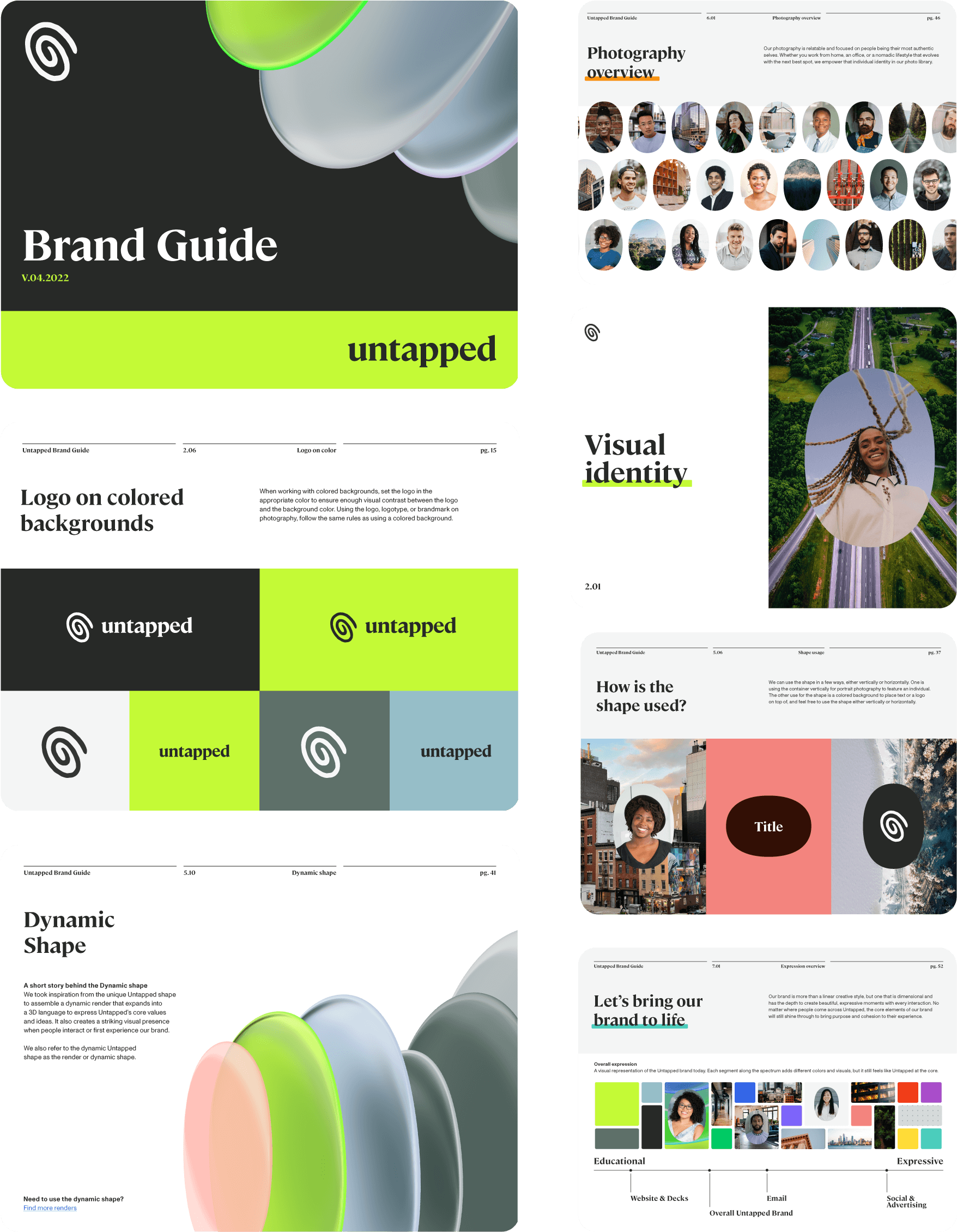
I joined Untapped as their first brand design hire, stepping into a brand that had just been done by Pentagram. The guide they left behind was technically thorough but filled with things that looked great in a Pentagram presentation and had no practical use in the real world. I rebuilt it from the ground up, revisiting everything from logo definition to typography and color, working closely with product designers to make sure marketing and product were finally speaking the same language. The end result gave future designers and non-designers alike something they could actually self-service from.
Visual Identity Creative Direction Presentations Employer Branding Icon System Design System Typography Color Swag Design Illustration
The Pentagram guide looked great and was nearly impossible to work from. This one was built for the people actually using it every day, designers, product teams, and non-designers who just needed to get something made without asking for help.
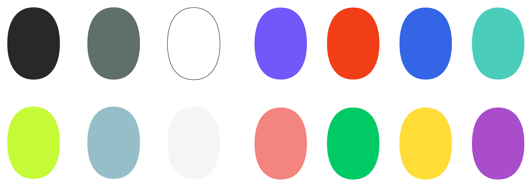
The original palette came with near-duplicate colors, mismatched blues, and two rosy tones that had no reason to coexist. Nothing felt connected to the core brand. I rebuilt it from scratch into a cohesive set where every color earns its place and actually works on screen.
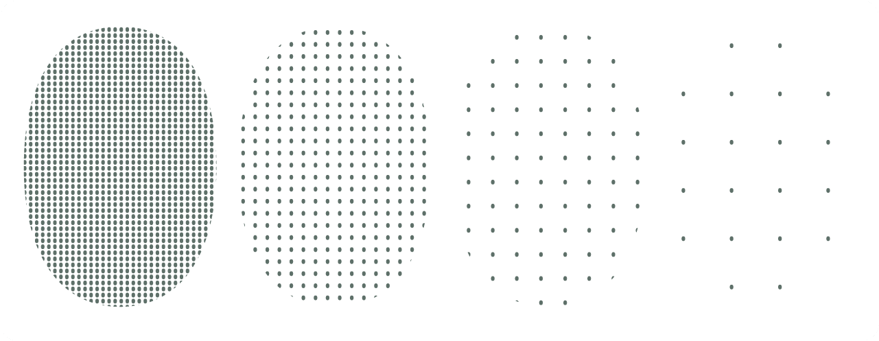
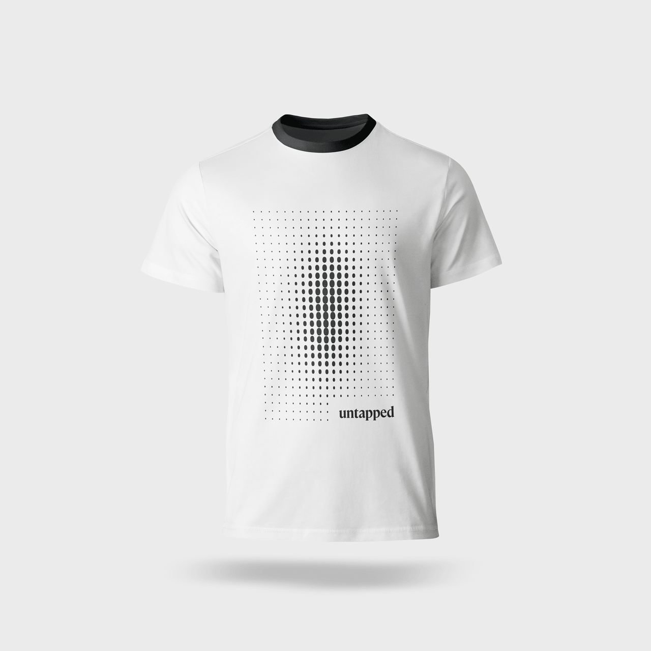
Pentagram defined the direction, I took it further. Four patterns ranging from dense to sparse, each one refined to actually pair well with a design rather than just exist in the guide.
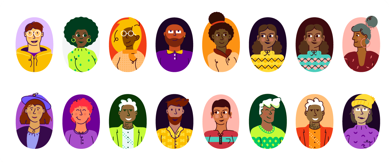
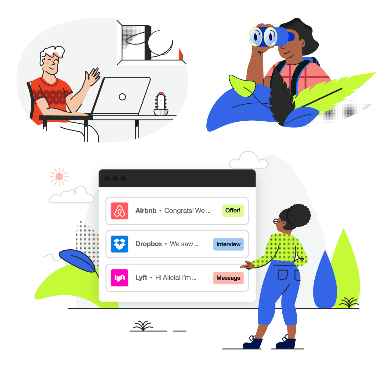
Untapped's mission is built around representation, so the illustration set had to reflect that. I built a custom skin tone palette from scratch and drew each person to feel genuinely distinct. A few break outside their container entirely, giving the set a little energy and life.
Built to match the people set in style while expanding the world around them. Nature elements, contextual environments, and enough variety to give the brand something to work with across different moments and applications.
The brand pattern front and center, with the Untapped brandmark used as a magnifying glass over it. Simple, considered, and the kind of shirt that reads as design-literate without trying too hard.
 in Colorado.
 Eric Gill ©
